
UX/UI Product Designer

PROJECT
CRAFTED PURE WATER’S E-COMMERCE: ENHANCING UX, BRANDING, AND INVESTMENT STRATEGIES FOR A SEAMLESS EXPERIENCE
SUMMARY
Crafted an e-commerce experience to identify potential customers and offer them opportunities to invest in a water impulsator, improving their health and living conditions.
RESPONSIBILITIES
Product Design
BRAND
This case study aims at documenting the website design for Pure Water that was done as part of my Internship as a user experience and interface design at FutureSight Studios, London UK in first quarter of 2022.
THE CLIENT
Pure is an Enagic water softener distributor specializing in residential and commercial water treatment systems. Pure is a truly independent firm, they provide the ultimate in water care technology to global business, industry and consumers - reducing limescale, preventing biofouling and offering chemical-free solutions with a broad choice of water impulsators, ionizers, a free water survey test, and other water products to meet all of their needs.
THE CHALLENGE
"Identify potential customers and offer them a way to invest in a water impulsator to improve their health and their living conditions."
EFFECTS OF HARD UK WATER IN HOME
Scale is hard on pocket
-
Every year 1.5mm of scale can build up – you can see it on taps and surfaces, but it also builds up where you can’t see it inside pipes and appliances.
-
Scale can damage appliances and central heating systems without you knowing.
-
Hard water can reduce the efficiency and working life of your appliances and service maintenance costs can increase.
-
You could be losing up to 70% in heating efficiency due to scale.
Unsightly scum and scale means hard work for you
-
Baths, basins, taps, tiles, glassware and crockery carry stains that are difficult to clean no matter how much time and money you spend.
-
Scale blocks shower heads and reduces water flow.
-
Scale forms on taps and is difficult to clean.
-
Soap scum is formed by the combination of hard water and soap. You also have to use more water to rinse your hands after washing them, and you have to use more soap to work up a lather.
Hard times for your skin and clothes
-
Deposits left behind by hard water cause problems for skin and hair. This is especially so for sufferers of dry skin conditions such as eczema.
-
Hard water leaves deposits on your hair. This makes it harder to wash and means you have to use more products.
-
Scum collects in your washing, making fabrics harsh and rough.
PROBLEMS
-
Many companies sell water Impulsators, but they don't enable customers to buy them on the spot.
-
Users would have to contact distributors to learn more about the product, such as pricing, specifications, installation techniques, and purchase information, resulting in a longer wait time and decrease user engagement.
-
Users must spend a substantial cost in order to acquire an ebook that contains additional information about the product.
PROPOSED SOLUTIONS
-
Provide an online eCommerce platform for customers to purchase products and schedule installations.
-
Provide free access to ebook content as well as the ability to download brochures for all relevant products.
-
Create a detailed product page with seamless integration for easy engagement.
PROJECT SCOPE
Our teams worked together to gain a thorough understanding of the problem, customer profile, industry, and all aspects of their current business model. We needed to build a website on the Ecommerce platform to provide Pure Water with a reliable platform and crucial integrations for processing and shipping orders, but we also needed to improve the user experience to increase conversion rates and income in the short term.
PRELIMINARY RESEARCH PROVIDED TO US
Target User Concerns
-
Is concerned about the Hard UK Water and suffers from health problems like Eczema.
-
Has interest in buying a water Impulsator to improve the healthy and lifestyle of their family.
-
Concerned about having to replace costly equipment every few years?
RESEARCH AND PLANNING
UNCOVERING THE BARRIERS TO INVOLVEMENT
The simplest way to get started was to collect the data of our target users to understand more about how hard UK water affects their homes and health and how Pure Water can help improve the problem. We started by putting it all together in an affinity diagram to organize ideas and learn about some common patterns to solve complex challenges, concerns, and touchpoints.

Affinity diagram aggregating the needs, motivations and pain points of a Pure Water customer.
COMPETITIVE/COMPARITIVE ANALYSIS
The next step was to gather ideas and determine best practices for establishing an eCommerce website. A competitive analysis was carried out. We began by visiting the websites of a few other water softener manufacturers, such as Harvey Water Softners, Fountain Filters, Hart Water Softners, EcoWater, and SureStop and observe some common functionalities and patterns that we needed to address.
One pattern we noticed across all of these websites is that in order to purchase a water impulsator, consumers must first fill out a form and contact the parent company, after which they will be linked to local distributors in their region. Another common feature we noticed was that none of the websites listed a pricing for the products, so consumers would have to download an eBook or a product brochure to learn more about them before placing an order.

Competitive Analysis Matrix
GETTING CLOSER TO USER-CENTERED DESIGN
DEFINING KEY DIFFERENCES IN MOTIVATIONS THROUGH PERSONAS
Because the audience for this project was narrow and only for people looking to purchase a water softner for their homes, we felt it was important to try and represent as many possibilities through creating personas that would help bring some clarity to their motivations and would become important reference points as functions developed.
As the research and design process progressed, we focused on developing the persona through quantitative and qualitative data as they represented a heavy emphasis on two key functions: evaluating the user's journey, decision to invest in a Water Impulsator and relying on the websites browse, search, and eCommerce functions to buy a product.
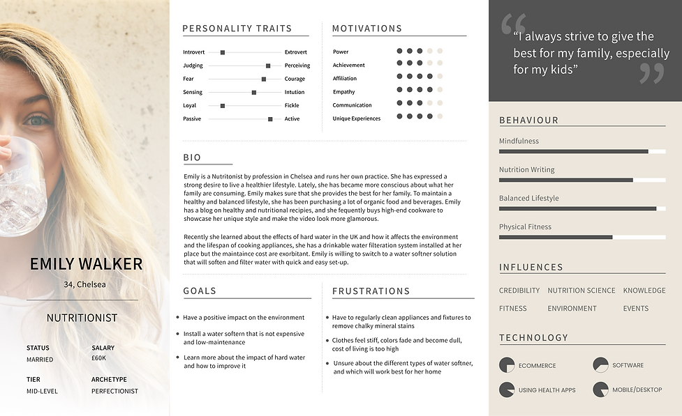
"Emily" wants to improve the health and lifestyle of her family
EXPLORNING COMMON TASKS TO HEIGHTEN USER EMPATHY
By creating and exploring the motivations and needs of the persona and their typical tasks, we uncovered key emotional/procedural moments that we needed to address. It was important to get the insight into a user's experience when interacting with a service across all touch points and channels. Each of these interactions directly affects the satisfaction of the user's needs, frustrations and touchpoints.

Proposed Customer Journey Map to Foster a User-Centric Approach
Customer action: The first step was the influencer visits your home to check water quality.
Customer perspective: I was unsure about which about product is the best for my family, after all, it is a huge investment. Since there were no direct competitors, it was difficult to compare and evaluate alternatives
"My current need was a trustworthy water ionizers - to keep my families safe and healthy, and what to expect from Pure Water and how will it take for the system to get installed?"
Organization action: Provide customers with the best quality product and increase customer engagement and turn negative experience into positive. Also follow up with them after they buy the product and give them a lifestyle customer support.
DESIGNING SOLUTION
USER FLOWS
Our user research uncovered clear pain points that we needed to address with our web app design. First, we would need to make it easy for users to find the relevant information. We started with writing down the starting position and the user goal and map them out to see how to flow goes.

Pure Impulsator Purchase User Flow
WIREFRAMING
VISUALIZING A USER-CENTRIC EXPERIENCE
After we defined the core functionalities that we needed to include in our design we developed low-fidelity wireframes. Wireframes helped us visualize the skeleton form of the interface.Due to time constraints, we went directly from sketching to greyscale high fidelity prototypes that helped us uncover problems with scale and information hierarchy.
Using these wireframes, we were able to conduct usability testing with 5 participants. This allowed us to gather some important feedback to help us decide what to include in the final experience before jumping into the next iteration of our design.By testing these wireframes we discovered problems users had with some of the call to action, as well as functions they were expecting but were missing.
The main points: each page was missing the cart icon, few of the user tried to search for the product using the search bar also users were not able to navigate back and forth on the pages. This information needs to be structured logically so that users can scan the pages quickly.


USABILITY TESTING
UNDERSTANDING WHAT USERS FIND INTUITIVE, AND WHY
Low-fidelity prototype testing allowed us to better understand how users expected to complete the tasks. Overall users found the website to be user-friendly; we just needed to address a few minor issues with navigation icons, and titles as well as few call to action buttons that were missing because to the non-optimized version.
We also observed that once the user adds items to the cart they were forced to checkout and not have an option to continue browsing, this confused users and hindered their ability to perform the tasks. We went through a couple rounds of iterations based on testing and feedback to make sure the wireframes were complete. We moved on to designing the UI when we had finalized the functionality of our design.
ESTABLISHING VISUAL DESIGN
Our team developed an UI kit because the entire information hierarchy from looking for a right Water Impulsator to buying one was a critical part to the success of this eCommerce platform and details such as button states, form elements, typography and relevant icons had to be explicitly defined.
We leaned into core elements of the UI, such as relying on the palettes primary blue - with a sense of calm and control simple button states and included typographic hierarchy; button styles, sizes, states, and variants, form elements, check boxes. greater detail with regards to grids and an approach for iconography.


DESIGN
HI-FIDELITY MOCKUPS
The high-fidelity prototype brought test users closest to the real experience yet and it revealed some issues. We iterated designs after each around of testing, and once we were confident that we had arrived at fairly comprehensive set of features for our primary users and user scenerio, we created high-fidelity wireframes to hand off to our devs.


FINAL SAY
WHAT I LEARNED
I went into this project assuming that this would be a single paged website with a quick single function: to request a home survey and download the eBook, however, I learned very quickly that users would also be required to have information they didn't have access to, in order to buy the product and the steps involved in it.
FUTURE CONSIDERATION
Aside from developing a mobile version, a second phase of this project would almost certainly include water treatment courses, a personalized account setup, and a configurable profile for returning customers, allowing for more streamlined purchases as well as the ability to stop their recurring services and other utilities and providing a more customized experience.