
UX/UI Product Designer

PROJECT
CRAFTED PURE WATER’S E-COMMERCE: ENHANCING UX, BRANDING, AND INVESTMENT STRATEGIES FOR A SEAMLESS EXPERIENCE
SUMMARY
Crafted an e-commerce experience to identify potential customers and offer them opportunities to invest in a water impulsator, improving their health and living conditions.
RESPONSIBILITIES
Entire Product Design from Research to Conception, Prototyping and Testing
BRAND

This case study aims at documenting the website design for Pure Water that was done as part of my Internship as a user experience and interface design at FutureSight Studios, London UK in first quarter of 2022.
PROJECT BACKGROUND
Hiking is a popular leisure activity that promotes physical fitness, is inexpensive and requires no special equipment and has become popular among people of all age groups. We humans are social animals and we normally prefer people around us to share and appreciate our experiences. It is entirely up to the individual whether to hike alone or with a companion.
However the majority of solo hikers encounter disappointing hiking experience which leads them to unsuccessful hikes. Loneliness and a feeling of isolation are cited as two of the most common causes for people abandoning their hikes. These findings show that having an online platform where hikers may connect with one another can make the trek more fun and enrich one's experience.
The goal of this particular project is to connect hikers with other ideal hikers, having a similar set of goals and equal expectations to conquer the hike as a team. Hikbud inspires hiking enthusiasts and helps them overcome their fears and provide endless opportunities to meet new people, organize hiking events and find compatible hikers to explore possibilities and challenge themselves and grow each day.
INCREASE IN OUTDOOR ACTIVITIES DUE TO COVID-19
-
Americans took up new activities in significant numbers in April, May and June of 2020. Among the biggest gainers were running, cycling and hiking.
-
Looking at April, May and June of 2020 versus the same period in 2019, unweighted participation rates for day hiking rose more than any other activity measured, up 8.4 percentage points.
THE PROBLEM
HIKE ANYONE?
The problem did not come as a surprise to me. As a member of several hiking and backpacking groups on various social media platforms, I regularly see people asking if anyone wants to join them on a hike, and the number of posts was in the hundreds each day.
 |  |  |
|---|---|---|
 |  |  |
 |  |  |
 |
THE CHALLENGE?
"Create an app that allows hikers to meet and connect with other adventure-seeking hikers in order to explore possibilities and hike the way they wish."
THE PROCESS
Hikbud design process aim to incorporate the key phases of Research, Analysis, Prototyping, Designing and Usability Testing in the product.

Overview
Define User Problem
Define User Goal
Survey Insights
Mission Statement
Affinity Mapping
Empathy Mapping
User Personas
User Journey Map
User Task FlowUser Stories & MVP
Ideation
Concept Sketches
Low-fidelity Wireframes
User Testing
Style Tile
High fidelity Mockups
Interactive Prototype
Usability Testing
Developer Handover
Design Presentation
Takeways
SURVEY INSIGHTS
With a fairly detailed initial research in hand, I first created an online survey to get an idea of the common possibilities and problem experiences by hikers and the factors that influence their decision-making process around planning the hike till completion.
I distributed survey through various channels, including several Hikers Facebook groups and within 24 hours I was able to begin synthesizing data from 22 respondents.

"Novice hikers and climbers have flocked to the outdoors, but some are unprepared for the dangers on the trails."
- The New York Times
WHAT ARE WE TRYING TO SOLVE
For any good design, we know how important it is to put ourselves in the customer’s shoes. To achieve a user centric design, my initial focus was to discover and define user problems through different stages of research. In this research phase, I spoke to our users directly to gather insights, patterns and trends that can help us identify the goal, user problems and their needs. I wanted to know:
-
What is the problem we are trying to solve?
-
Who is the targeted audience ?
-
What are the reasons for the problem?
-
How often does these problem occur?
-
Why do we need to solve it?
-
How can we solve the problem?
THERE IS SOMETHING OUT THERE
To gather insights, I conducted interviews and surveys. I ensured our participants were within our targeted audience, which are individuals with some hiking experience.
I interviewed 5 hikers with the objective to learn about their:
-
Goals and objectives of their hike
-
Preparation and research methods before their hike
-
Hiking experiences
-
Challenges and outcomes during and after their hike
-
Takeaways
"I chose this mission for hikers who are brand new to this area and do not have connections to the local hiking community and feel overwhelmed to go on a hike alone. This vision is to help them find a suitable trustworthy and compatible hiking companion who can share the time and skills to hike the way you want to hike."
AFFINITY MAPPING
Through screener surveys and interviews, I gathered a good amount of insights to help me move forward with the design process. I decided to organize the interview insights to see what were some commonalities shared among the participants. Therefore, I used an affinity map to visually lay out and group the observations gathered.
.jpg)
EMPATHY MAPPING
Using these categories above, I was able to understand the challenges, goals and outcomes for each targeted user when it comes to planning their hikes. These further helped me create Empathy Map allowing to empathize and synthesize users observations and learn about their needs.

IDENTIFIED PATTERNS AND TRENDS
-
Users enjoy sharing hiking experiences
-
Users find it incredibly rewarding to hike with partners
-
Users goes through a lot of research before planning their hike
-
Users rely on navigation tools to find their way on trails
-
Users rely on weather apps to decide the type of gear to carry
-
Users like to connect with other fellow hikers and plan their next adventure
USER PERSONA
Next, I created Anna to represent our target audience. Anna has to go through a lot of research and stress before she begins her hiking adventure. I wanted to create a seamless experience by emphasizing on simplicity. Using our insights I have tried to achieve the challenges and goals Anna would like to accomplish while planning her hike.

CUSTOMER JOURNEY MAP
To further learn about Anna’s hiking experience, I created a journey map. Anna’s journey map shows few highlights and pain-points across the planning, during the hike and after hiking experiences.

A user journey captured in an experience map
DEFINING RED ROUTES
I further, identified red routes for the product to prioritize user needs and optimize features that will capture use cases of all the users and add value to the product, leaving a substantial impact on user experience.

FEATURE PRIORITIZATION
For feature ideas, it was important to look into every users need and consider their desirability to what they seek in a product. This helped me prioritize the biggest pain point and opportunities for my product and allowed to determine what really matters most to the majority of the users.

USER STORIES
Based on target audience needs and analysis, I created User Stories to prioritize the MVP. This gave a rough idea of all the features that I am suppose to deliver which would include new trends, innovation and high-tech solutions for the users.

DESIGNING THE SOLUTION
USER FLOW
My user research uncovered clear pain points that I needed to address with the app design. From here I could decide what actions and features were crucial and beneficial, and designed a user flow around these conclusions.

EARLY SKETCHES
I sketched each iteration and added the elements and screens that were necessary to reach users' goals, to quickly see which ideas worked best. I put the sketches into Marvel app to build an interactive prototype and tested some user stories with five different individuals.
Findings:
-
Users has problem accessing the bottom navigation tabs.
-
Users value the personalized content
-
User asked for option to see their saved selection in the onboarding process.
Solutions:
-
Re-design the navigation bar using larger icons and adding interactions.
-
Provide access to view and edit saved information

STYLE TILE
Next, I created a Style Tile to communicate a design vision for the product. This helped us structure and organize the project ensuring that the visual directives, style, and general feel reflects the same on each page.
IMAGERY


COLOR PALETTE

Dark Electric Blue
#466E79
Opal
#B1D2B9
Topaz
#FECD72
Bright Gray
#EDEDED
Gray
#BDBDBD
Outer Space
#484848
White
#FFFFFF
LOGO


DESIGN PATTERNS


TYPOGRAPHY

WIREFRAMES AND WIREFLOWS
Next, I ideated my sketches into a low-fidelity interactive prototype done with Figma. I defined UI elements using the red route, design patterns and visual hierarchy. I tested the prototype in-person with 5 individuals.
Findings:
-
Participants had difficulty moving ahead when they clicked on 'create account' label located on the splash screen.
-
The identity verification indicator in the user profile area did not attract the user's attention.
-
Participants took a while to navigate the ‘nearby hikers’ tab located in the bottom navigation.
-
Participants had difficulty navigating the hamburger menu when asked to host an event.
Solutions:
-
A sign in and sign up label should be placed on the splash screen for easy accessibility.
-
Make the identity verification icon bigger as well as increase the font size.
-
Redesigning the bottom navigation and increasing the font size may make it easier for users to access and locate the tabs.
-
Having a 'host event' icon on the dashboard bottom navigation bar would make it easy for users to locate and access it.
HI-FIDELITY
After extensive research, ideation, brainstorming and user testing. I finally got to the fun part of transforming my low-fidelity designs into a hi-fidelity prototype for my final round of testing.


THERE's ALWAYS A SCOPE OF IMPROVEMENT

Most of the users were looking to sign up to the app using social media account
Having a checkbox for each selection helped users feel confident about the progress
Users had difficulty accessing the bottom nav, the new design highlights each icon with a solid background color and bold text for better accessibility
Users had difficulty accessing the Hamburger menu, when asked to host an event. The new design gives access to the icon with a label in the navigation for easy usability
Users were not sure why they were redirected to the dashboard after sending out the invites. The refined design let the users know their action and directs them to the event page to view more events
A edge case design was implemented for users to change their preference and selections further allowing them to personalize their information and how they want to use the product.
Users did not recognize the Join event label. The new design makes the label look bolder adding a background for easy accessbility.
The down arrow button confused the users to a scrolling bar. The purpose was to bring back the profile back to its position. The refined designed shows a back arrow indicating that it will take the user to the previous page.

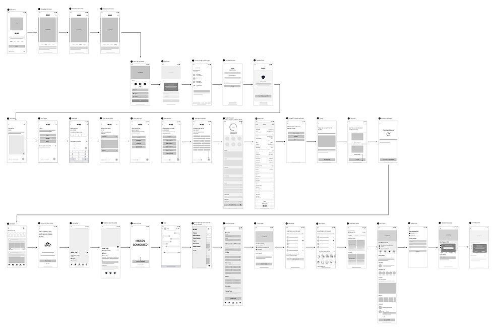
FINAL PROTOTYPE
After a few more iterations, I designed the final screens with Figma. I conducted usability testings during the process to define the design pattern, interactions, elements and colors.
My aim was a clean, modern look that helps users fulfil their goals quickly. "Hikbud" is an hiking adventure app; therefore, my focus was to provide easy and clean interface using colors and images that reflect patterns of nature.
I also designed illustrations to keep the look fresh, diverse and modern.
RESULTS AND TAKEAWAYS
Working on a project individually was an extremely steep learning curve. Although I was nervous at the beginning, I soon learnt to trust my instincts and design process. I also learnt that active communication with my mentor were key to ensuring the project’s success. It was an eye-opening experience that taught me a lot about being lean and knowing when and where to focus your energy and efforts. All participants expressed positive feedback, that they are likely to use the proposed ‘Hikbud’ app if it was available on the app store. They found the proposed Hikbud app to be well-organized, comprehensive, clean and uncluttered, very useful and easy to use.
Some key takeaways from this project are:
-
Don't get too caught up in the details. I made the mistake of obsessing about the UI's appearance earlier in my journey. I was able to reprioritize the UX by taking a step back and reassessing the user processes.
-
Focus on the problem. At the end of the day, you'll be solving for your users' problems, so keeping that in mind is critical. It's easy to lose sight of this when you're caught up in the day-to-day errands.
-
First impressions first. Hikbud is all about bringing adventurous hikers together. It is important to prioritize the user experience because users will only care about how they use the product. The simplicity of our app's user experience helped us to stand out and differentiate our offering.
-
Focus on building an MVP. It is important to focus on the features that will provide the most value to your users.