UX/UI Product Designer

PROJECT
IMPPROVING THE UX FOR THE GLOBAL LEADER IN THERMOGRAPHY TRAINING
SUMMARY
Revamped the ITC website to create engaging content for users interested in leveraging Infrared Technology to expand their global product offerings.
RESPONSIBILITIES
UX Design
Interface Design
Branding
BRAND
This case study aims at documenting the website revamp process that was done as part of user experience and interface design at FutureSight Studios, London UK in first quarter of 2022.
THE CLIENT
The Infrared Training Center (ITC) is a vendor neutral, training and consulting group within Teledyne FLIR specializing in infrared applications among a variety of condition monitoring applications. Infrared Thermography Center is the world's largest and leading infrared training and certification provider with more than 4,500 certifications issued annually around the globe in a variety of local language program. ITC also is the only one to be certified to the ISO 9001:2000 Quality Management Standard. ITC offers a vast array of application-focused courses from beginner to expert, like Electrical and mechanical systems, building and roof applications, optical gas imaging, furnace inspection, and research and development courses.
"ITC wants to provide engaging content for users who are interested in learning about using Infrared Technology to expand their product offering worldwide. How well does this address visitors pain points and goals?"
OPPORTUNITY
Our brief was to provide ITC with recommendations and suggestions on how they could improve the overall UX UI of their current website and create a positive user journey that aligns with their existing marketing strategy.
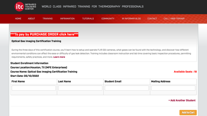
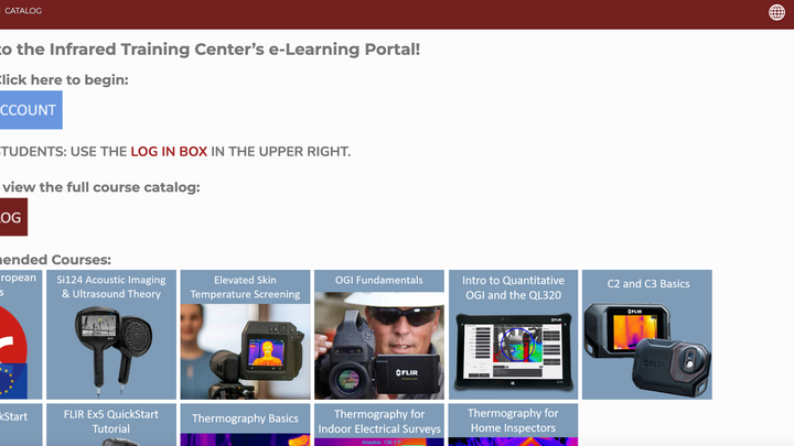
ITC didn't reflect the dynamic. Aesthetically it was a visual disaster which didn't do justice to the brand purpose. The information Architecture was highly complex and amplified confusion for its users. The problem we noticed was, there is no seamless experience that handles end-to-end checkout process that customers are truly satisfied with.
Primary Business Needs:
-
Create clean easy navigation (from admin, student and instructor perspective) for new as well as returning ITC customers.
-
Display courses in ordering of ITC's preference. (Level I, II & III)Present information in a hierarchical format
-
Offer SSO integration for users to enroll in coursesAbility to view courses and buy them without signing in to LMS (Learning management system) Portal
-
Ability for someone else to purchase a course for one or more studentsAbility to checkout using different payment gateways considering the region used are based.
THE SOLUTION
A Website Redesign - We needed to design a system that could logically represent the large range of content they provide, such as different levels of thermography courses, classroom types, certification, publications, and an easy way to buy a course for oneself and someone else. It was also critical to develop a current and appealing visual design that would highlight the brand's individuality.
To lead potential clients in the right way, make it simple to comprehend the company's value and facilitate a great user experience by providing helpful and relevant material.
BRAND VALUE
MISSION
To offer high-quality infrared thermography training and certification to teams and individuals that will enhance effectiveness and credibility, reduce risks and chances of downtime, and bring value to your business.
VISION
To make a world a better and safer place through premier training in thermography.
METHODOLOGY
Using the Double Diamond design process and Agile methodologies we applied a KANBAN framework to the project sprint.
Mural - Used as a primary project management tool within the team. Here we created, prioritized and delegated the project backlog tasks at every stage of the process.
.png)
The ITC Mural Board | managed showcasing - Task Owners, Team Members and Project Backlog
Daily Stand Ups - Using Discord as our main communication platform each morning teammates delivered progress updates on the tasks they were completing. Here Backlog tasks from Mural were heavily referenced and daily goals outlined and time boxed.
Weekly Retrospects - Held at the end of every week to ensure team members kept on the same page and communication was open and fluid.
OBJECTIVE
Through further discussion with their team the objective that we defined was to research, strategize and designing an end-to-end user experience to help them buy Thermography Courses, with a focus on increasing conversion rates by 30% on the previous MVP.
ITC design process aim to incorporate the key phases of Business Analysis, Surveys, Secondary Research, Competitive/Comparative Analysis, Affinity Mapping, User Flows, User Personas, Site Map, Wire-framing, Prototyping and Usability Testing in the product.

To gain a better understanding of how we could effectively address the requirements for ITC, we used affinity mapping to identify common themes in the data we collected. As a result of this activity, we were able to discover several major trends that we needed to address in the next phase of our design process.
RESEARCH AND PLANNING
UNCOVERING THE BARRIERS TO INVOLVEMENT
%20-%20ITC%20-%20Key%20Attribu.png)
Key Takeaways
1. Increase revenue in HVAC, building and home inspectors industry.
2. Increase revenue by offering an on-site training, that would allow sponsors to provide de-energized equipment to use in some cases.
3. Allow users to quick filter courses by language, location and classroom type.
4. Allow users to checkout using the FLIR portal as well as integrate guest checkout.
5. Allow users to buy courses for someone else.
SECONDARY RESEARCH
To validate our findings, we conducted some secondary research focused specifically on why individuals don't enroll in ITC courses. Teledyne FLIR did extensive study for ITC on this topic, which explored the key reasons why students prefer alternative institutions/certifications for Thermography Training. While the reasons listed were consistent with our findings that the most common barriers to participation are a lack of time, money, and resources, the article also revealed an important insight: most people do not enroll in the course because they must pay extra to earn a certification that must be renewed every four years, as well as the convenience of learning on site.
CURRENT SITE ANALYSIS
Opportunities
We looked at the current ITC website to determine their existing areas of focus and what could be improved to address both business and user needs. We found that overall the website was more catered to Electrical/Mechanical students as they are the most profitable market verticle with a secure training budgets and likely obtain thermography certifications within their organization. We also found that ITC focus heavily on the oil and gas industry which is their highest grossing training course because they make up the highest rates of student retention.
Threats
The building market has been challenging for ITC to break through. Customers are price sensitive and the value add of certification is not a strong selling point. Several providers offer students membership to their respective organizations that assist them to find business leads, brand, and build an inspection business. Students in this market are particularly interested in low cost, on-demand training. ITC monetizes <$100k annually in on-demand learning which is <1% of their annual sales revenue. ITC have not seen a good ROI developing on-demand training.
So, it’s not surprising that we identified several issues that might discourage an individual from getting involved in enrolling in a thermography course including:
-
A lack of hierarchal information that displays courses levels (I, II and III)
-
An inefficient enrollment process
-
A lifetime value
-
A lack of evidence showing the impact that ITC alumni has made and the impact you can have as an individual
COMPETITIVE/COMPARITIVE ANALYSIS
To gain inspiration and identify best practices for our website redesign, we conducted a competitive analysis. We started by looking at the websites of a few different Thermography Training including The Snell Group, Infrared Training Institute, Infraspection Institute and Building Performance Institute.
One common feature we noticed across these websites was the placement of Courses Offered and Courses Level in order to emphasize it as the main call to action. This was an important architectural feature to consider in order to make it easier and simpler for users to get involved and enroll in a course.
Another common design pattern we noticed was that all of the institutions prominently featured their services and upcoming events at the forefront of their webpage. This was a crucial approach for efficiently engaging users in enrolling in a course without having to look for it across multiple pages.
We observed that many institutes had pre-determined call to action on each page, which made the enrollment process easier and more efficient for users.

Competitive Analysis Matrix
GETTING CLOSER TO USER-CENTRIC DESIGN
DEFINING KEY DIFFERENCES IN MOTIVATIONS THROUGH PERSONAS
Because the audience for this project was so wide, we felt it was important to try and represent as many possibilities through creating personas that would help bring some clarity to their motivations and would become important reference points as functions developed.
As the research and design process progressed, we focused on developing personas through quantitative and qualitative data as they represented a heavy emphasis on two key functions: evaluating the user's journey, decision to enroll in a thermography course and relying on the websites browse, search, and filter functions for viewing course options.
.png)

DESIGNING SOLUTION
INFORMATION ARCHITECTURE
Our user research uncovered clear pain points that we needed to address with our web app design. First, we would need to make it easy for users to find information with call to action about different levels of thermography courses, including dates, location, classroom and most importantly language for each of the courses offered. The website would also need to make it simple to get the users enrolled in a course for themselves or anyone who is looking to buy the courses for someone else and, once there, simplify the process of navigating from selecting the course to buying one While most of this information was available on the ITC website, the fact that these frustrations were mentioned repeatedly in user surveys indicated that we needed to improve on the existing information architecture.

Proposed Information Architectures for ITC
USER FLOWS
To address ITC's business goals and improve the overall enrollment experience, we created user flows for two types of audiences using distinct account options within the webapp (Login or Guest) which further allows them to buy courses for themselves or for anyone else they want to enroll. If the users opt to login, the browser will identify them as returning user and they will not be required to provide any additional details.
We also created payment gateway flows based on the locations and the platform that our users have access to. Our users requested a way to quickly access the courses that were offered, as well as additional information on specific thermography courses such as location, language, instructor bio, and most importantly the cost.
%20-%20User%20Flows%20(3)_pn.png)
%20-%20Payment%20Gateway%20U.png)
Thermography Course Enrollment User Flow
Checkout User Flow
WIREFRAMING
VISUALIZING A USER-CENTRIC EXPERIENCE
After we defined the core functionalities that we needed to include in our design we developed low-fidelity wireframes. Due to time constraints, we went directly from sketching to greyscale high fidelity prototypes that helped us uncover problems with scale and information hierarchy. And designing responsive mobile wireframes in this mode helped us make decisions about what elements could be made secondary because of space.
Using these wireframes, we were able to conduct usability testing with 50 participants who were already familiar with thermography training. This allowed us to gather some important feedback to help us decide what to include in the final experience before jumping into the next iteration of our design.By testing these wireframes we discovered problems users had with some of the call to action, as well as functions they were expecting but were missing.
The main points: each page should have a strong call to action and a way to navigate back and forth. This information needs to be structured logically so that users can scan the pages quickly.
USABILITY TESTING
UNDERSTANDING WHAT USERS FIND INTUITIVE, AND WHY
Overall, users found the website to be user-friendly; we just needed to address a few minor issues with navigation labeling and positioning of course descriptions, titles as well as few call to action buttons that were missing because to the non-optimized version.
We also observed that between adding courses to the cart and checking out, users had to go through additional steps. On each page, there were too many elements and call to actions, which confused users and hindered their ability to perform the tasks. We went through a couple rounds of iterations based on testing and feedback to make sure the wireframes were complete. We moved on to designing the UI when we had finalized the functionality of our design.
ESTABLISHING VISUAL DESIGN
While ITC team has a set of guidelines for user experience, it hadn’t been updated since 2014. It does cover topics such as color, typography, grids, and photography, but does not justify the current UI library.
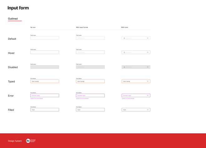
Our team developed an additional UI kit because the entire information hierarchy from enrolling in a course to the checkout process were critical to the success of this project, and details such as button states, form elements, typography and relevant icons had to be explicitly defined. This new UI kit is designed to help improve the existing one.
We leaned into core elements of the existing UI, such as relying on the palette’s primary red, black and white and the global use existing ITC logo and a responsive grid with typical breakpoints.
The area we thought we could expand included typographic hierarchy; button styles, sizes, states, and variants, form elements, check boxes. greater detail with regards to grids and an approach for iconography.
Visual UI Library for ITC
DELIVERY PHASE
HI-FIDELITY MOCKUPS
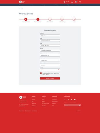
Finally, once we had completed all of the research and architectural styles, we were ready to start working on high-fidelity wireframes for the primary desktop experience. Wireframes were still a bit of a challenge after we established our Golden Circle of what, why, and how we were going to approach things. Of course, we went through rounds of feedback, but it was pretty easy to move things around without involving design ego for graphics.
The important factor is that each page should have a distinct purpose and present information architecture in a hierarchical manner with engaging content. This data must be structured logically so that people can scan the page quickly and achieve their goals.
Content always comes first, once you know what the page needs to achieve you can then focus on elements and graphical composition.
MOBILE VERSION
FUTURE CONSIDERATIONS
ITC CUSTOMER SUPPORT
Moving forward with this project, aside from mobile version, a second phase of this project would be looking at the longer perspective of how to get ITC users involved with in-house customer support. This includes using a variety of offline methods to ensure communication, seek information and add a chatbot to relevant pages of the website. Possible ways this could be conducted include giving users the opportunity of filling out and submitting a contact form, speaking with a professional, and receiving specialized one-on-one assistance for their concerns.

Proposed Customer Support Project Plan for ITC
FINAL SAY
WHAT I LEARNED
One idea that this project reinforced me was the importance of precisely outlining how a team should operate, particularly during a pandemic when every project is managed remotely by team members from all over the world who are still learning fundamental UX design principles and creating their own workflow. We prioritized a 15-minute daily scrum to address where we each were at, any concerns we had and what we intended to proceed with for the day. We maintained these daily and it was extremely valuable in establishing open communication within the team.
We were able to make progress and collaborate successfully because we were able to work on the same platform at different times. Throughout the project, we used time boxing for practically every activity. This kept our team on track and allowed us to move on with the project in a timely manner at each level.
KEY TAKEAWAYS
The importance of research - This project required a lot more research than prior ones. I saw this as an opportunity to hone my research abilities while also learning more about our users, thermography training, infrared technology and its uses, and how we can work together to make it useful and simple for the students. It was an eye-opening project, and I'm glad I was a part of it since it will benefit me in my design profession in the future.
Adapting changing requirements - New deadlines, resourcing challenges and reprioritization meant the scope of the project, which was constantly changing. As a team, we had to adapt those changes and still deliver the best UX in time with tight deadlines.
Don't underdeliver - I learned the importance on how to define a true MVP and prioritize something that would add value to the product.


